I often see people ordering their own professional printing and then being disappointed with the results due to not being aware of printing limitations or due to issues that could’ve been avoided with a little insider knowledge. It’s really disheartening to see people so excited to see their printed project (often after they’ve put a lot of work into designing it themselves!) only to be disappointed with the outcome. As a designer, I usually manage the printing for my clients, but for anyone that is managing their own printing, there are things that you need to be aware of. So here are 5 things I wish everyone knew about professional printing.
1. Colour variation is extremely common
The most common complaint I hear when it comes to professional printing is that colours aren’t printed accurately or they don’t match other printed media. This is extremely common. In fact, colour variations of up to 10% are considered acceptable in the industry.
The vast majority of printing is done using CMYK printers. The colours that can be printed with these printers are limited. They’re not capable of printing all the colours that can be displayed on screens. There can also be dramatic colour variations between screens and between printers. There are speciality printers and printing methods that can produce a wider range of colours, but this won’t happen automatically, you need to discuss this with your printer.
You can also experience colour variations across printed materials. Colours print differently depending on the printer, the paper stock, the printing method, the print operator and even the weather.
Printers can match colours, but you need to work with a printer that does this and communicate your needs to your printer. Let your printer know the colour you want to achieve by giving them a Pantone colour to match and/or samples from a previous print job that you were happy with.
2. Printing with Pantone inks doesn’t automatically guarantee colour accuracy
An alternative to printing with CMYK ink is Pantone (PMS) printing. This printing method can be utilised when you want to print a colour that can’t be printed with CMYK or you want to improve colour accuracy. These inks can be used either instead of, or in conjunction with CMYK inks. Pantone printing can be a good option if you want to improve colour accuracy, but there’s a misconception that Pantone printing will automatically guarantee that colours are printed correctly.
Pantone printing is great for colour accuracy, but there are still limitations and this doesn’t happen automatically, you need to work with a quality printer. Firstly you need to find a printer than can actually do Pantone printing, and you need to let them know that this is what you want to do. Setting up a print file with a Pantone colour isn’t enough, they’ll most likely just convert the file to CMYK and print accordingly unless you specifically request Pantone printing.
Printing in Pantone is a manual process, so there’s a risk that mistakes will happen. Even if the print file is set up with the correct Pantone colour, and you confirm the correct colour with the printer, the print operator may accidentally mix or select the wrong Pantone colour. There will also still be colour variations between different print mediums so adjustments need to be made accordingly.
3. Your graphic designer needs to know exactly how you’re going to print
As a designer my biggest frustration is not knowing how a job is going to be printed. Will it be printed digital or offset? How thick will the stock be? Will it be coated or uncoated? Is there provision in the budget for special finishes? For the best results, and to avoid errors, designers need to know exactly how files are going to be printed. Designers know a lot about printing too, so can offer you guidance on what will work best. Decisions about how printing will be done should be made before the design is created. You don’t want to give your designer free-reign to design something, only to discover that you don’t have the budget to print it, or your mailhouse can’t work with it.
4. Incorrectly set-up print files can lead to printing errors
The printing industry is incredibly competitive, and it’s also common for designers to provide print files that have errors or have not been set-up correctly, either due to inexperience or not being told the print specs. Some printers, trying to keep their customers happy and their printers running, will attempt to fix errors themselves. This can lead to problems down the track because the client and/or designer may keep creating print files with errors, not realising that anything is wrong, until one day an error is not corrected and suddenly the printing is unusable. There’s also a risk that the printer may change something that they think was done in error, when the designer actually set it up that way intentionally.
5. Specialty printing require specialty printers
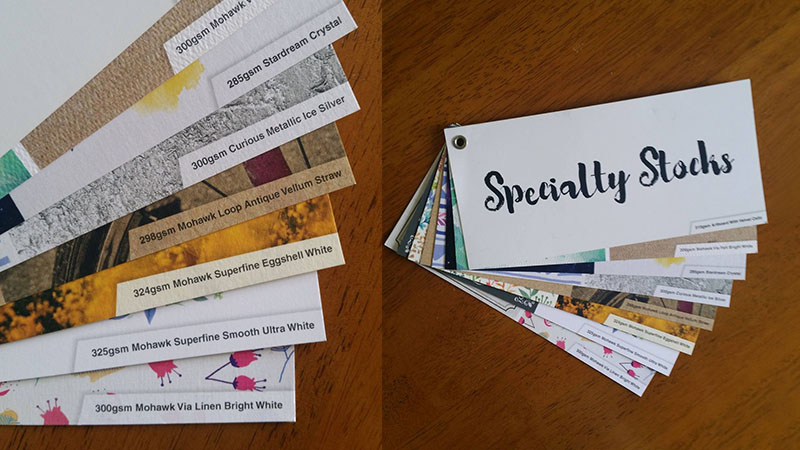
There are some really cool things you can do the make your printing look unique, but these are outside of the realm of standard CMYK printing, if you want them you need to work with a printer that can do speciality printing, and communicate what you’d like. Even if your print file is setup for special finishes, they won’t be printed automatically. In an ideal world, the printer would see that the print file doesn’t match up with the print specs, and ask you about it, but this doesn’t always happen.
The number one thing I wish everyone knew about professional printing is you NEED to communicate your desires with your printer (and your designer if you have one). Don’t rely on your print file alone to convey information. Always let your printer know exactly what you hope to achieve, give them physical examples if you can, and make sure you sign off on a soft or hard (ie. digital or printed) proof that outlines the print specs.


